
Saturday, 21 December 2013
Draft Front Cover 2
Friday, 20 December 2013

Thursday, 19 December 2013
Draft of Front Cover

Tuesday, 17 December 2013
Front Cover Process

First of all i changed the levels of the image so that my model didn't look to discolored from the lights in the location of the image. this also added more tones to her. Next i used the select tool and selected the pupils. By doing this i was able to increase the colour of the models eyes. Just like the tutorial in my research. Then i enhanced the white sections of the eyes so that this empathized the blue in her eyes. After that, i used the heal tool to get rid of any spots and marks on her face so that her face looked soft and flawless.

I then repeated these steps but adjusted the models t-shirt, hair, cheeks and lips.
To the t-shirt i made the shirt more blue so that it matched the models eyes and didn't look so dull. To the models hair, as i like the models original hair colour i thought only to enhance it a little bit so that it looked lush and fresh. I wanted to add colour to my models cheeks so that she looked healthy and had a nice glow, so i choose a light brown colour so that it could create this affect. Adjusting the opacity so that it didn't look too much. Lastly for the lips, i chose a solid red colour to make her lips stand out more. I chose quite a dark red as i wanted her to look more country then if i chose a light red, as she would then look more pop, then country western theme.

Because the guitar in my opinion looked dark, and didn't really stand out in the image, I decided to change the levels to make it brighter, and so that the textures would stand out more. To this I used the select tool and selected the main body of the guitar (that I wanted brightening), I then went to curves and adjusted it so that it looked bright but not over the top. at this amount, you can still see the texture and light marks on the guitar, making it still realistic.
For the floor, I did the same process with the guitar but instead I selected the floor and brightened it so that the models shoes would show up more and not blend into the background.
Monday, 16 December 2013
Photographs of Model


Photographs of Location


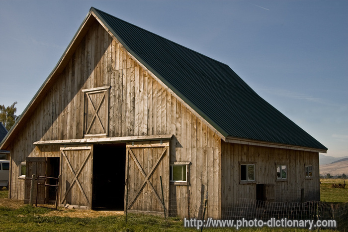
These images are of a barn at a garden center near to where I live. I thought it was a good idea to take a range of photos within my area, like this, so that it would give me inspiration for my contents page and double page spread.


These images where taken on the outskirts of the town I live in. About a 10 minute drive away I came across a few streets and farm land with a few barns filled with hay stacks. I decided to photograph a range of the barns so that I could choose from a variety for my contents page and double page spread. I also came across what appeared an abandoned home which had an unused, decayed out building at the back of the property. I photographed a few different frames of this so that again I had a range to choose from which suited my style of music.
Friday, 6 December 2013

Magazine Masterhead Ideas

Looking at the style of text I want to use, I have written all my name ideas to see which one I prefer. Overall I prefer the left style of text because it looks more country music style and I this type of text is similar to one of the music magazine covers that I analysed. Also the text style on the right doesn't look as exciting or interesting as the other style of text.
Tuesday, 3 December 2013
Magazine Text Styles

Looking at different types of text styles, I came across these which I thought would look appropriate for my country music magazine. As country music is quite formal I think that the most appropriate style of text for my magazine would be one of or more than one of these: Mesquite Std, Haettenschweiler, Myriad Pro Cond or Adobe Caslon Pro.
Thursday, 28 November 2013
Magazine Names

The names above are my ideas for my music magazine. As I still wasn't too sure on the name I had a range of ideas so that when people came to choose the best name, there was a wide variety to choose from. In my opinion the names that stand out for me would be, CM Today, In Tune, Voice and CMM. However, it would be interesting to see what other people think, and if that influences my decision for the name.

Tuesday, 26 November 2013
Production Planning
28th November - Detailed Mock Front Covers
29th November - " " " " "
5th December - Shooting Photographs (20 photographic images, of all)
6th December - " " " " "
12th December - Photoshop Manipulation
13h December - " " " " "
19th December - Final Design
20th December - DEADLINE front Cover
29th November - " " " " "
5th December - Shooting Photographs (20 photographic images, of all)
6th December - " " " " "
12th December - Photoshop Manipulation
13h December - " " " " "
19th December - Final Design
20th December - DEADLINE front Cover
Friday, 22 November 2013
Video Tutorials
This video above is a make up tutorial to get a natural look. In my opinion going for a natural makeup will be better for my specific music genre as country music artist tend to look natural and focus more on their music than there appearance.
This video tutorial is about improving the colour of a persons eyes on photoshop. This will be good to use when editing my model to make the eyes stand out more, or improve the eye colour of my models eyes don't look very pure.
Friday, 15 November 2013
Photographic Influences


Most of the images shown above are cover albums. Looking at the location in all of them, they all appear to be outside. With this in mind it maybe suitable and better if I where to take my magazine images during the spring or early summer season. All the models are female and fairly young so for the better of my magazine and to appeal to my target audience, it maybe a good idea to have a model of of this age.
Looking closely at the models they all appear to have a middle parting and their hair down, when photographing my model I may choose someone to fit this description or take this style into account. For my double page spread I may take inspiration from the first image and include props to reinforce my genre. Also it would show to the audience that she is passionate about country music and this may be relatable to some fans.
Props + Locations


Looking at the images I have gathered I have come up with a suitable location and costume for my model to wear and where to photograph her. The two locational images are of a barn inside and out. This has given me the idea to photograph my model for the double page spread in a farm location. I live close to a couple of farms in my area so it would be prefect to shoot my model in those locations. This will then show the audience that my magazine genre is country because they can associate the farm with the style of music.
I have gathered some prop ideas off the internet that I could have my model wearing. All these images associate with a country western person and will influence my chosen music genre style. Most of the props I have chosen are leather material. I chose this material because this can be associated with the equipment used when riding a horse. This influences my music genre.
I have also looked at the possibility of having electronic fan to add slight movement to the model and make it look as though she is outside and her hair is moving by the wind.
I have also looked at the possibility of having electronic fan to add slight movement to the model and make it look as though she is outside and her hair is moving by the wind.
Cast
For my magazine I want to cast a model that looks similar to the looks in these images. I researched images that associate with a typical country girl. These images came up so for my cover of my magazine, I am going to cast a female that has fairly long hair that's wavy and a natural, soft look. Country music is quite slow compared to other genres so its important to cast someone who reflects the genre. These people above best portray the style of music.
Wednesday, 13 November 2013
My Audience Media Profile
1) A4 information that profiles your audience
2) Post a video interview with a typical member of your audience

2) Post a video interview with a typical member of your audience

Tuesday, 12 November 2013

Wednesday, 6 November 2013
Friday, 18 October 2013
Thursday, 17 October 2013
Music Magazine Brief
Main Task
The front page, contents and double page spread of a new music magazine. All images and text used must be original, produced by you - minimum of four images.
The front page, contents and double page spread of a new music magazine. All images and text used must be original, produced by you - minimum of four images.
Sunday, 13 October 2013

LIIAR Analysis of Your Front Page & How You Achieved it
Language
Looking at my front cover the model in the image is facing directly at the camera. This show shes if giving full attention to the camera and appear very engaging. this is effective because when a the reader looks at the front of the cover, the reader feels as though the magazine is interacting with he/she. The shot is a medium close up which captures the models facial expressions, this can also be engaging for the reader to look at. The lighting in the image is very neutral and by photographing outside, there is no light shines on the models face which is usually created by a studio lighting. This shows the models natural beauty. By taking the image outside and not in a studio setting, the overall appearance of the model looks better because the studio lighting could of made the model look to bright or too pale.
Institution
This magazine was edited and created using photoshop, by me.Ideology
The model on the cover of my magazine shows she is a keen learner and stands for the perfect student. Because she is holding a folder this signify that she comes to college to learn and be successful, she has the right approach to learning. Having a model student on the magazine makes the reader think that maybe they should take this approach to learning. Because of the confidence in her body language this makes the reader feel that they should be more confident to ask about studies and go to staff to ask for help. If the reader isn't confident at college they should see someone about help in been confident with their education.Audience
This magazine is aimed at college students between the ages of 16-18. Looking at the colour theme, the light blue colour appeals to boys mainly. The red text appeals to females. By combining them together, they make the magazine appeal to both gender. This is effective because the magazine isn't bias and doesn't appeal to any specific gender. The magazine uses both script and serif text. Script usually appeals to female, whereas serif appeals to males, by having both this makes the magazine appeal to both genders than just one.
Representation
The text used represents the magazine and shows the reader that the company is aware of what both genders are appealed to. The choice in text is also professional and shows that the company takes pride in its magazine as it chooses formal text, which is legible and posh. The Times New Roman text is very formal and is a very posh style of text, this shows that the magazine is expensive and appeals to the more higher class citizen. The script text is very friendly and informal, this shows the friendliness and reliability of the magazine. the Plantagenet Cherokee text shows the balance between the two texts. Plantagenet Cherokee text has soft strokes and is still formal like the Times New Roman text, a text between the two different types of texts. This makes the text and appearance of the magazine in the middle between formal and informal, which appeals to a broad audience. The model on the cover shows intelligence, confidence and determination. This is shown by the models body language. By posing with confidence this is reflected through the magazine and indicates to the reader that if you have little confidence you should read the magazine to gain some. The determination from the model to learn and do well in college is shown through her dedication to learning and showing a positive attitude to education. The magazine is portrayed as being expensive and appealing to all different people between the ages of 16-18. This is in forced by the colour, text and the body language of the model in the magazine.
How I Achieved my Final Cover
To achieve my final cover I researched all the appropriate things I would need to get my final cover. I included research of different previous magazines, different photography's I could take, different type styles, magazine names and I also researched different examples of front covers. My research mainly involved researching online and looking at previous magazines to get an idea of how I could produce mine. I then began to design templates of my magazine and looked at how I could develop it further with the faults that previously held back the design. By improving my drafts I then began to get a clear idea of what I wanted my cover to finish up looking like. Next I went and took multiple images that I could use to include in my magazine. By looking at all my images I could then pick out the best one and use it for my final front cover. I had all the resources I needed to produce my magazine, so I then had to put them all together. Using photoshop, I was able to edit my model and add text to a blank page. I began arranging my magazine similar to my final draft. Realising difficulty with understanding text and arrangement issues, such as the magazine looking over crowded, I managed to move things around to resolve this. By using my draft, and the faults such as organisation and positioning of text, I was able to resolve this with my final cover and hopefully end up with a more improved version.
Draft of the Contents Page


By researching and looking at previous contents pages from different types of magazines, I came up with an improved second draft that I will use for my magazine. I prefer this draft contents because the page is fairly full which makes the magazine more interesting and engaging. I placed the title of the magazine in the same place as the front covers title, I liked the positioning because it gave more room and structure to place the other things that will go on the magazine. I placed the contents in the same place but changed the colour black, to stand out more and made it smaller so it didn't over power the title. I placed the contents information in the same place but made it smaller so that it didn't take too much room up. This aloud space for a bigger picture and make the magazine cover look more visual. I then changed the page numbers so that the magazine appeared more realistic. I kept the positioning of the photograph the same, but made it bigger so that it took up more of the contents. I did this because from personal experiences when looking at a content, you don't need to look at it for a long time, if there's a photograph the viewer will tend to look at the contents for longer if there is an image on the front. Lastly I included a small yellow box, splash to include extra information that I could put in to draw the readers attention.
Saturday, 12 October 2013
Photographs Taken

These three images are of the model and the best one of the three will appear on the front of my magazine. I will have to crop these images when making my magazine because these images are long shots. My brief states that I am to photograph a medium. to do this I will crop to the waist of the model and cut off the sides as this will make the image a medium close up. I like these images because the models body language shows confidence which shows that the magazine is engaging. it also shows that she is proud to attend the college. As this is a magazine college students will see her on the cover and been drawn to the confidence as she looks approachable which can make a magazine appear this.
 For my magazine, I wont be using these images because the model has moved and therefore she isn't in her original position.
I could use this image as a background for my model as this will could be more appealing than a plain background. The colour would also stand out from the model, this could have a negative affect on the model and drown her out. Also by adding a background like this to a previous image, the model may look too edited and not look professional.

I could also use this image as a background for my magazine cover. This background would work well as it is a familiar background. With this in mind it links with the title 'lifestyle', because you would usually see this scene around your college so its very relatable. However this image may not work, like the image above it may not look right having the model against it. The background may also stand out more from the model, this could then make her not stand out as much than if she was on a plain background.

I will use these images for the cover magazine to go onto the splash. this will make my magazine more interesting because splashes tend to draw the reader in and find out about the promotion. When making my magazine I will crop the sides so that the book is only framed and increase the levels of the images so that they look better quality than they do now.
Friday, 11 October 2013
Digital Mock-up of Front Cover

First Digital Mock up
This is my first digital mock up of my front cover. The red square will include my skyline, 'Secret to success inside today's copy'. I chose this because it is very short and simple and directly tells the reader what my magazine will include. When I come to do my final magazine cover I am going to do the back colour in red, as this will match the colour of my cover lines. I will then do the text in white as this will stand out more against the red background. The dark blue box will include my magazines masthead, 'Wyke College Lifestyle'. I choose this title because it was also simple and clearly states what the magazine is going to be about. due to the magazine being targeted at 16-18, if the magazine covers name is short and simple there more likely to read ahead. I know this from previous experiences. Also by looking at previous magazine covers, they all appear to have short titles. The green box will include the main story line, 'Remember Check Your Emails'. I chose this because it is very important to the school at the moment. I thought to include this because its important to include actual concerns in the magazine to make my magazine professional. The light blue box will include my main cover story. This will be the revision technique story and will include a small brief of what will be included in the magazine. In the orange box I will include a cover story to my magazine. This will be related to time management and will include a brief information about managing students time efficiently. This will be brief and inform the readers of what will be inside the magazine. In the purple box I will include my medium close up of my model. I positioned the photograph to the left side to allow text at to the right side. Lastly I will include a splash at the bottom off the page. This will use up the space at the bottom of the page and include another dimension to my magazine. in the bottom right corner I will put my bar code. I will position it here because its not a very important aspect of the magazine so placing it here, it is out of the way and allows more space for cover lines ect.

This digital mock up if of my first draft above, I have included more information onto the magazine so that I can get an idea of what my final cover may look like. I added the title of my magazine with the text that I decided I wanted to use. By doing so I can see if I need to change the positioning or increase the size. I also added an medium close up that i found of the Internet to also see if I need to change anything. By adding extras to the magazine I can then get a more visual interpretation to what it may look like. Looking at the mock up, I have come to the conclusion that I may change the layout. By having to the left than the right, our eyes immediately look from left to right. If we put the image to the right, it will be the first thing they see and draw there attention to the magazine. I may also make the title bigger, or adjust its location to make it stand out more from the magazine.

This digital mock up if of my first draft above, I have included more information onto the magazine so that I can get an idea of what my final cover may look like. I added the title of my magazine with the text that I decided I wanted to use. By doing so I can see if I need to change the positioning or increase the size. I also added an medium close up that i found of the Internet to also see if I need to change anything. By adding extras to the magazine I can then get a more visual interpretation to what it may look like. Looking at the mock up, I have come to the conclusion that I may change the layout. By having to the left than the right, our eyes immediately look from left to right. If we put the image to the right, it will be the first thing they see and draw there attention to the magazine. I may also make the title bigger, or adjust its location to make it stand out more from the magazine.
Subscribe to:
Posts (Atom)